The first time I've read about division using tan() and atan2() in CSS due to a great article by Jane Ori
it passed through my head without much thought, a neat trick, but I didn't see any practical use for it. Only years later I found a use case for it in my own work, which I've made case study in this article.
In this writeup I want to explore how calculations work, how it led to usage of tan(atan2()), and how this trick will become obsolete.
Calculations in CSS
Most calculations in CSS are done with the calc() function,
which allows you to perform arithmetic operations on compatible values.
Great thing about calc() is that it can handle values with different units, transforming them into a logical result.
.element {
  width: calc(100% - 20px);
}
On the other hand, significant limitation of calc (and other functions that allows for calculation inside, like clamp(), min(), max()) is that division (x / y), and multiplication (x * y) are, still in most browsers, restricted to use with at least one unitless value.
.element {
  width: calc(100% / 2); /* OK */
  height: calc(100% / 2px); /* Error */
  margin: calc(20px * 2); /* OK */
  padding: calc(20px * 2px); /* Error */
}
The current state of the CSS Values Spec allows it in some capacity:
In previous versions of this specification, multiplication and division were limited in what arguments they could take, to avoid producing more complex intermediate results (such as 1px * 1em, which is <length>²) and to make division-by-zero detectable at parse time. This version now relaxes those restrictions.
So in theory those calculations should be possible:
.element {
  width: calc(100% / 2px * 20px);
  height: calc(100% / 2px * 20px);
}
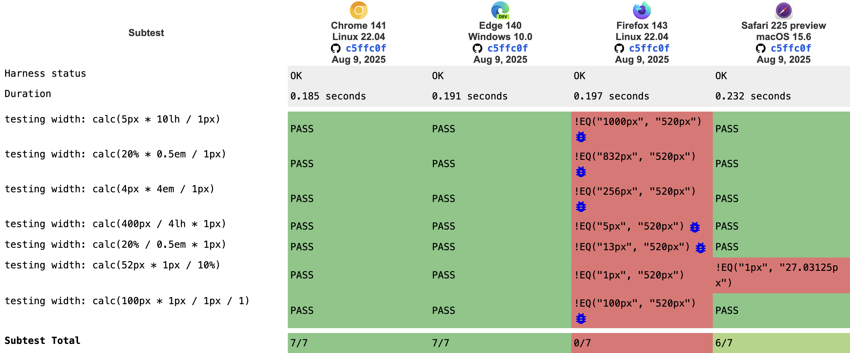
And in practice table of tests shows that it's not widely supported yet.
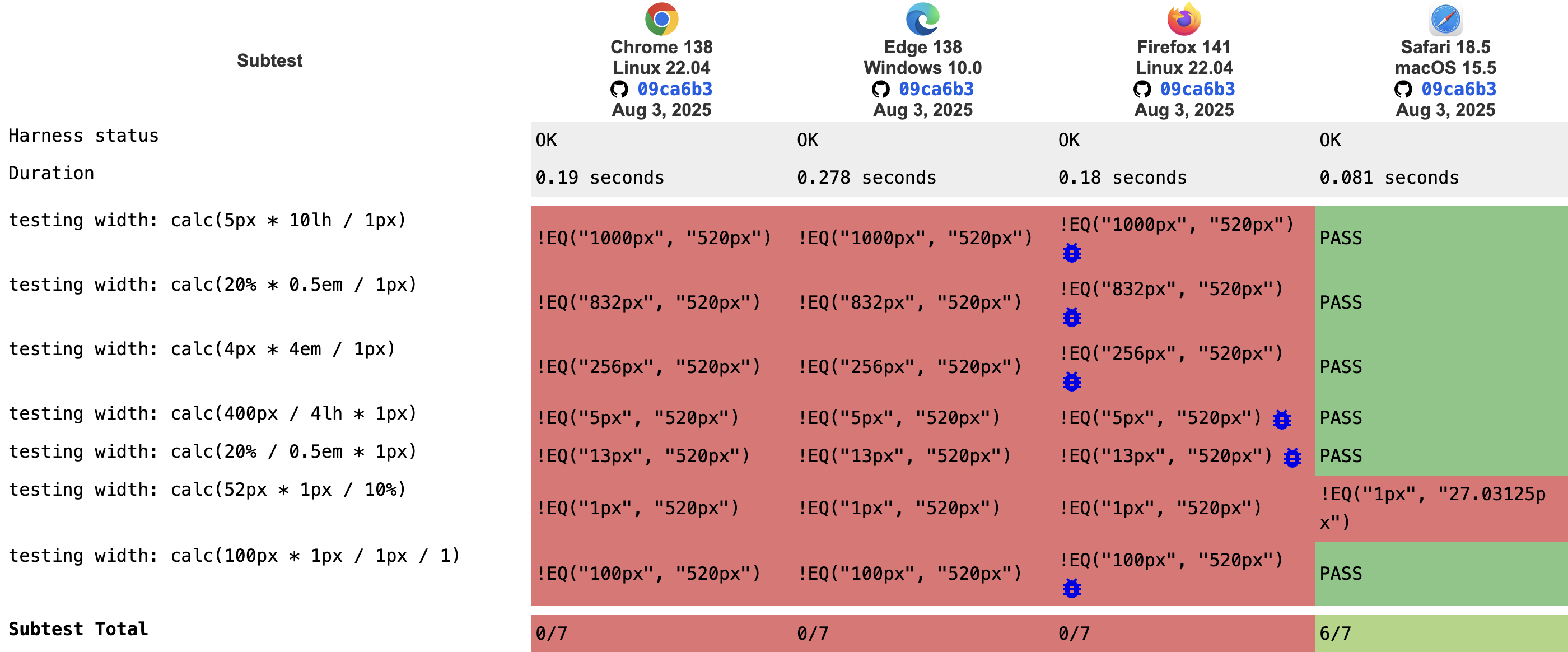
But table of tests for pre-released versions is way greener!
tan(atan2()) and more complex calculations
tan() and atan2() trig functions are widely supported by browsers, and combining them is equivalent to division.
The theory behind it is well described in article by Jane Ori.
.element {
  width: calc(tan(atan2(50em, 2px)) * 1px); /* OK */
  width: calc(50em / 2px * 1px);  /* Error */
}
Division of two values with the same unit results in a scalar value, so to keep the unit correct after division, we need to multiply the result by 1px to "reattach" unit to a scalar value.
In practice
In this example we will try to fit as many elements in a row as possible without showing a cut-offs, given min width of the child element. It may be a useful base for building complex custom layouts.
<div class="parent">
  <div class="row">
    <div class="element">element 1</div>
    <div class="element">element 2</div>
    <div class="element">element 3</div>
    <div class="element">element 4</div>
    <div class="element">element 5</div>
  </div>
</div>
@property --fit-amount {
  syntax: "<integer>";
  inherits: true;
  initial-value: 1
}
.parent {
  container-type: inline-size;
}
.row {
  display: flex;
  width: 100%;
  overflow: hidden;

  --child-min-width: 200px;
  --fit-amount: max(1, calc(tan(atan2(100cqi, var(--child-min-width))) - 0.5));
  --child-width: calc(100cqi / var(--fit-amount));
}

.element {
  width: var(--child-width);

  flex: 0 0 auto;

  height: 40px;
  border: 1px solid blue;
}
Step-by-step
Just for presentation we set .row and .element to be inline without any shrink/grow.
.row {
  display: flex;
  width: 100%;
  overflow: hidden;
}

.element {
  flex: 0 0 auto;
  height: 40px;
  border: 1px solid blue;
}
Let's break down the main calculation part:
@property --fit-amount { /*3*/
  syntax: "<integer>";
  inherits: true;
  initial-value: 1
}

.parent {
  container-type: inline-size; /*1*/
}
.row {
  --child-min-width: 200px;
  --fit-amount: max(1, calc(tan(atan2(100cqi, var(--child-min-width))) - 0.5)); /*2, 4, 5*/
  --child-width: calc(100cqi / var(--fit-amount)); /*6*/
}
container-type: inline-size;will setcqiunit to be based on the width of this elementatan2(100cqi, var(--child-min-width))calculates how many elements we can fit into a single row@property --fit-amount { syntax: "<integer>"; }will ensure that the--fit-amountis a whole numbercalc(x -0.5)combined with@property --fit-amountwill floor--fit-amount.max(1, x)ensures that fit amount will be greater than 0calc(100cqi / var(--fit-amount))calculates the width per element to fit into a.parent
You can notice that we use regular division in calc(100cqi / var(--fit-amount)) - that's because --fit-amount is already a unitless value.
Once the current specification is fully supported by browsers we will be able to substitute --fit-amount calculation with:
.element {
  --fit-amount: max(1, calc(100cqi / var(--child-min-width) - 0.5));
}
In the same specification document we can find round(<rounding-strategy>?, A, B?),
which will allow us to simplify it even further:
/* we can remove whole `@property --fit-amount` block */
.element {
  --fit-amount: max(1, round(down, 100cqi / var(--child-min-width)));
}
Note on Firefox
It seems that Firefox does not internally cast every value to px, hence we need to cast 100cqi to px before using it in atan2().
This small addition should cover all browsers:
@property --available-space {
  syntax: "<length>";
  inherits: true;
  initial-value: 0px;
}

.row {
  --available-space: 100cqi;
  --fit-amount: max(1, calc(tan(atan2(var(--available-space), var(--child-min-width))) - 0.5));
}